Nourish Market
Eugene, or
Scope: interior design, lighting, and electrical design and selection, project management, custom cabinet design, custom graphic design, branding and logo creation, custom mural design, interior decor, styling and accessories
This was one of our more involved projects to date, from design to drywall to dishes. We were tasked with transforming this 5,000 square foot cream-walled employee break room into a beautiful, efficient marketplace that upheld the company’s values of sustainability and honoring their employees. Being cognizant of efficient flow and usage and the main marketplace feature, we added a coffee / tea serving area, a bussing station, and a recycling station. All of this needed to tie into our design already established throughout the building. Custom-designed cabinetry and counters were made to match existing cabinets but configured for this unique purpose and maximized much-needed storage. The nature of this project required our understanding of food display needs and commercial grade appliances, including the facilitation of selecting reusable containers. We created an extensive and careful electrical wiring plan to support the new configuration, appliances, and additional accent and task lighting.
An early requirement of this project was to create a branding plan for the new marketplace and overall breakroom around which we would base the rest of our design. We settled on a name and created a logo and signage to fit the fresh and local theme. With our brand idea in place, we began designing and implementing the physical structures and their placement. We defined the market space using color, accent lighting, signage, and a 25-ft mural. Across from the market, we used an existing row of cabinets to create a plating area and condiment serving station.
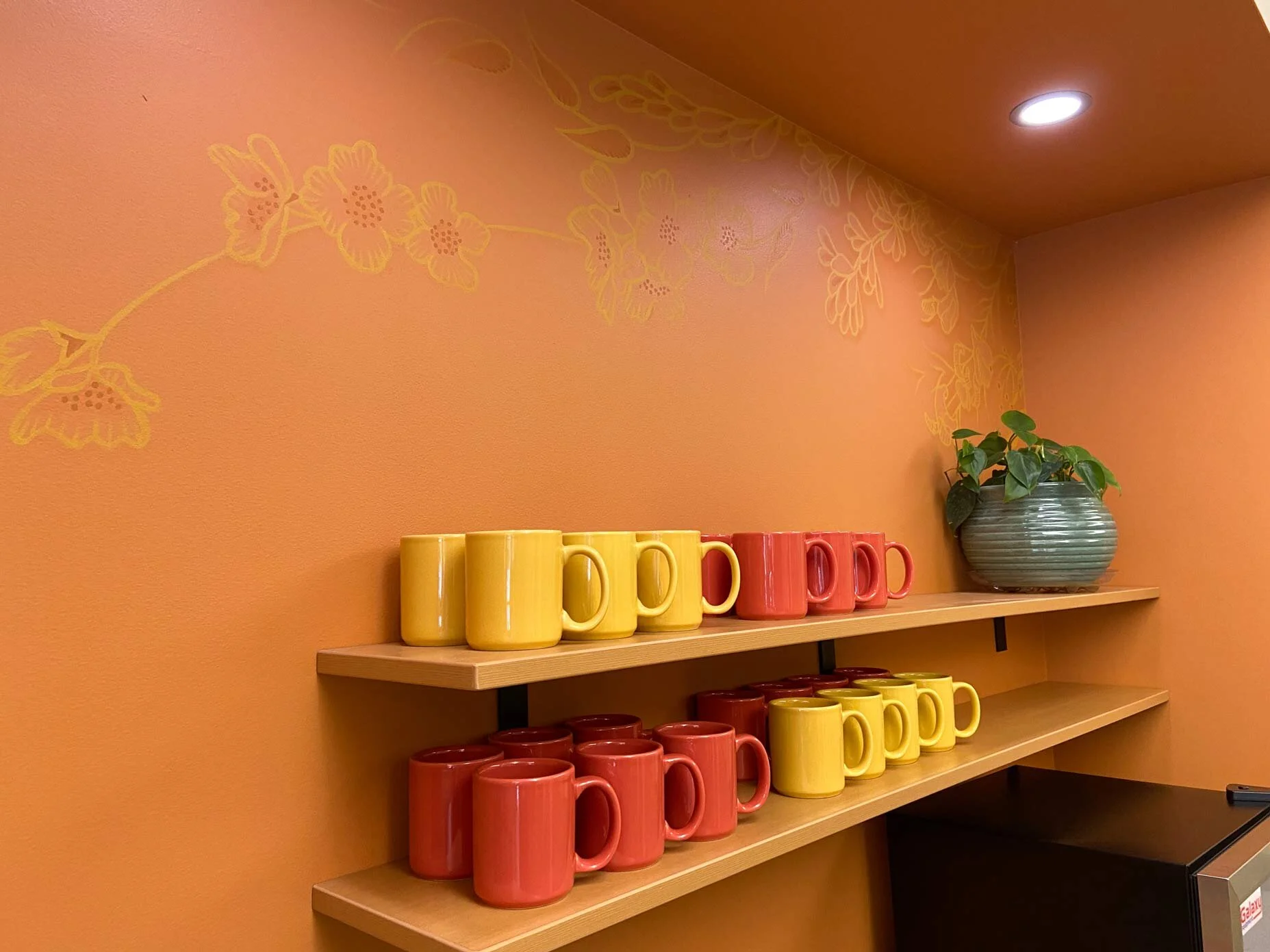
A favorite part of the new marketplace is the hot drink serving station where employees can get tea, coffee, hot chocolate, or filtered water. Sat Hari designed and painted a botanical-themed mural softening the hard edges and visually merging the water bottle filling station with the coffee / tea serving station. It also connected this new area to the other sides of the room.
This project required a wide variety of skills, and our design supported the day-to-day operations of a busy employee lunchroom, break room, and company marketplace. Working within some oddly placed existing walls, we designed a layout focused on flow and efficiency, delivering an easy-to-use and maintain marketplace overlooking a bright and colorful employee break room. read less.. read more
“It’s pretty consistent that many creative people are not as business-minded. I deal with this all the time with architects, designers, chefs, etc. in previous client work. However, I wouldn’t at all put Sat Hari in that camp. She’s a gem!”
~ Company Executive


